VI for AGI
|
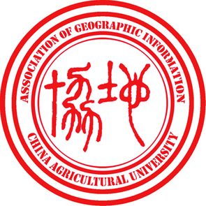
地理信息协会 (abbr. 地协), an academic club in the major of GIS, was founded in the College of Information and Electrical Engineering at China Agricultural University in 2007. I joined it in 2011. As the Director of the Publicity Department of AGI from 2011 to 2013, I chose the formal English name for it -- Association of Geographic Information, or simply AGI, and designed its VI.
The design to the right, featuring English name of the club in the outer circle and the Chinese version written in the distinctly traditional seal-carving style in the inner circle, has served as our association badge/seal. De facto, this design was inspired by the Seal of Peking University. |
|

|
The design to the left, with the initials "A," "G," and "I" and a fancy earth in the middle, is the official association flag.
|
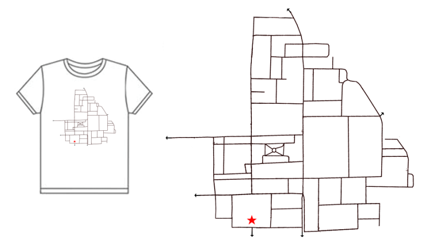
Graduation Tee
|
Most Popular Tee Design in 2014 China Agricultural University Graduation Tee Design Competition.
The pattern of polygons was derived from the roads in East Campus of China Agricultural University. The red star indicates the location of the statue of Zedong Mao at the main gate of the campus. The little arrows indicate all of the gates of the campus. |
|
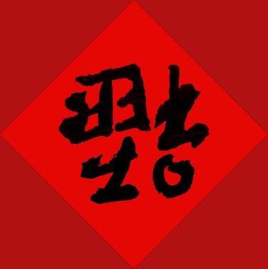
English Word OR Chinese Character?
|
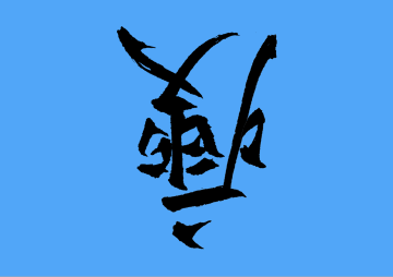
If you know Chinese, you are highly likely to know this is character 「福」 reversed. What you might not know is that this character consists of five English letters. Else (I mean if you do not know about Chinese character), please give me a chance to explain: When it is Chinese New Year Eve, Chinese will attach some red paper on the door. On the red paper, particularly, on two rectangle pieces of paper, some parallel sentences of luck words are written, and the pair of paper is called 「对联」. Between the two pieces of a「对联」, there is generally a piece of square paper a character of「福」 is written on. This 「福」 character means "lucks" and it is commonly attached reversely to indicate the the meaning of 「到」, which literally means "arrive," because it sounds like 「倒」 meaning "reverse."
|
|
|
Yes, now you see it. The five letter making up the character are those in the word "OFFER." So the design above means "Here comes the offer" as well as "Here comes the luck!"
This word and character was designed before the Spring Festival in 2014, and later, actually two years later, was partially authorized to 「微臣教育」, an education institute in China, for their commercially use. |
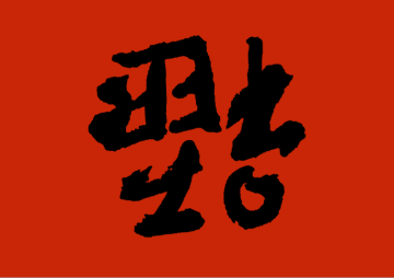
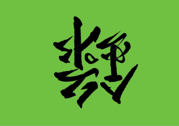
Further, I designed another two, 「錄」(lù, or admission) and「瘦」(shòu, or fitness), which sound like 「祿」(lù, or wealth) and 「壽」(shòu, or longevity), respectively. Together with 「福」(fú, or luck), these three characters are really auspicious in Chinese culture and are usually used together.
|
|
Icon for an app

The most recent design I am proud of is the icon for the app PiCo.
As you can see, it is a flat camera. What you might not be really aware of is, this camera has two shutter buttons. If you wonder why, please check out this demo:
As you can see, it is a flat camera. What you might not be really aware of is, this camera has two shutter buttons. If you wonder why, please check out this demo:
